Announcing jQuery Mobile 1.2.0 Alpha
The jQuery Mobile team is excited to announce the alpha release of 1.2.0. This release brings a new popup widget, an autodivider option for listviews, and a host of enhancements and fixes throughout the library to make things smoother, faster, and more polished. Try it now!
Demos & docs | Key changes | Change log | Download & CDN | Supported Platforms
KEY CHANGES

New Widget: Popups
The biggest feature of 1.2 is the new popup widget. The idea with popups is to create a flexible element that makes it easy to place any content or widget in an overlay that floats above the current page. This makes it easy to build a simple tooltip, menu, popup form, map overlay, or lightbox with this same widget.
Popups follow the markup pattern of dialogs and consist of a container with a data-role of popup and a link with a data-rel of popup that points to the ID of that container. When the link is clicked, the popup is shown. Clicking outside the popup, hitting the back button, or pressing the Escape key all close the popup.
Here is the basic markup you need: a link and popup container.
<a href="#popupBasic" data-rel="popup">Open Popup</a>

<div data-role="popup" id="popupBasic">
	<p>This is a completely basic popup.<p>
</div>
We've worked hard to make the popups as flexible as possible to let you get creative. By default, popups are styled as a simple box with the same theme as the current page, rounded corners, and a drop shadow. Popups don't have padding which makes it really easy to drop in a widget like a listview to create a menu.

Out of the box, there are options to control whether how it's positioned (centered over the thing you tapped, the window, or any selector), add a semi-transparent overlay layer behind the popup, use an animated transition when the popup opens, adjust theming, and more. We've also added a few advanced demos showing how to build a lightbox by working with image scaling, use embedded iframes in popups for maps and videos, and even make a very custom looking side panel by tweaking styles and working with the API.
Check out the popup docs for more on the options, methods, and events APIs.
Collapsible Lists
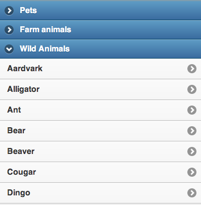
We've had lots of requests to make collapsible listviews that would reveal a nested listview when a row is tapped. Rather than create a new extension for listviews, we realized we could adapt of existing collapsible widget to do the trick (thanks to sjdecaires for the suggestion).
Now collapsibles have a data-inset option which still defaults to true to keep the current collapsible appearance. When this is set to false, the collapsible goes to the edges of the screen, just like a non-inset listview does. By then placing a listview inside these full width collapsible, we achieve the effect of a collapsible list.
To make what looks like a collapsible list that allows multiple sections to be open at once, stack up a series of individual collapsibles with a listviews inside. To force only one section to be expanded at once, use the collapsible set (accordion) to get this behavior.
We're really excited to bring this new capability to the library by just adding a single option to the existing plugin set and hope to find similar opportunities to add powerful features with minimal code.
Listview Autodividers
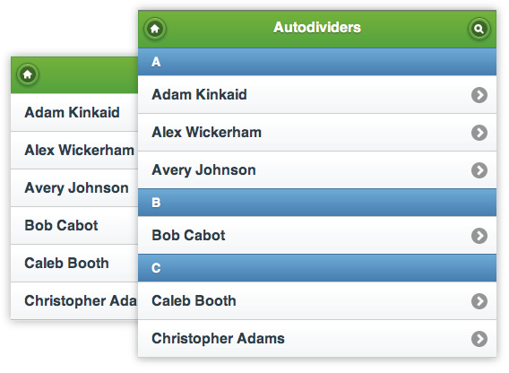
Speaking of listivews, we have a cool new feature in 1.2: autodividers. Simply add the data-autodividers attribute to any listview and the framework will automatically add alphabetical list dividers based on the contents of your list.
<ul data-role="listview" data-autodividers="true">
This is especially helpful when generating lists dynamically. Best of all, this feature is designed to work seamlessly with our listview filter extension so dividers will be added and removed to stay in sync with the current set of filtered items.
Read-only Lists: Flat Visual Style
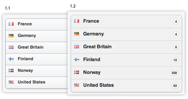
We've tweaked the design of read-only listviews in 1.2 to make them look less clickable by removing the gradient from the list items and only using the flat background color. It's a subtle change, but it does help to provide a clearer visual separation between clickable and read-only lists.
Prior to 1.2, read only lists were also given a bit less padding because we figured that these didn't need to be as touch-friendly as normal, clickable listviews. However, we found that some folks were using listviews with a mixture of linked and non-linked list items and that shift in padding didn't look right.
We now use the same padding for both read-only and linked list items.
Controlgroup Icon Buttons: Easier to Tap
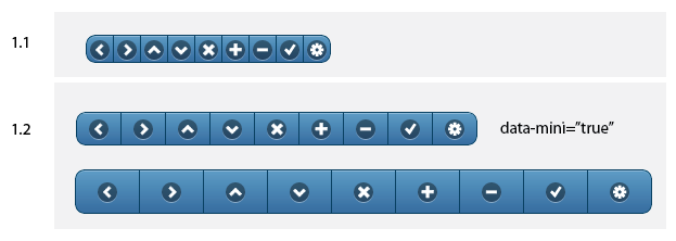
When icon-only buttons were used in controlgroups, they were simply too small to be finger-friendly so in 1.2, we've improved the design to increase the padding around the icons to make them easier to tap.
If you still need to smaller style, you can add the data-mini="true" option to the controlgroup or individual buttons to reduce the size of the button groups to be closer to the way they were in 1.1, but they are still large enough to still be usable.
Buttons in Toolbars: Now Mini by Default
Prior to 1.2, link-based buttons were mini by default, but not buttons based on input and button elements. Now, we automatically make these mini sized for visual consistency. If you ever need to revert to larger buttons, that option is available via the data-mini attribute.
All Form Elements: Width Adjustments in Fieldcontainers
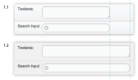
We recommend that most folks use the fieldcontainer markup pattern when building forms to take advantage of the responsive label styling. This stacks the label above the input at narrow widths and floats it to the left of the input at wider widths to take full use of tablet and desktop devices.
In 1.2, we've made some refinements to the design for this pattern to make sure we're using as much of the horizontal space as possible for the form element. Labels have always been 20% + 2% margin and now the form element widths have been increased from 60% to 78% so they go as full width as possible.
We've carefully tested every form element in a wide variety of situations to ensure that the spacing and sizing of each is as consistent as we can for a polished experience.
Touch and vmouse events: Now available for standalone use
We've decoupled all of our plugins and have a clear dependency map which allows us to offer the download builder tool (Alpha) to let you build the leanest package possible. However, we heard that some developers just wanted to grab the virtual mouse events that normalize between touch and mouse inputs (vmouse) or the touch events like swipe or touchstart but don't want to use the rest of the jQuery Mobile library.
In this latest release, we've refactored a bit to eliminate the dependency on mobile core for utilities like these. Now if you want to take advantage of just our vmouse events, simply check that box in the download builder and grab the file. Other utilities like orientationchange and throttledresize are also available without the core dependency in the builder.
This additional decoupling is only available if you choose 1.2.0 alpha or latest in the version dropdown of the download builder tool.
Support for jQuery 1.7.2 (and soon 1.8)
jQuery Mobile 1.2 now supports versions 1.6.4, 1.7.1, and 1.7.2 of jQuery core. We recommend that you use 1.7.2 to take advantage of all the improvements in the latest release. We're working on fully testing 1.8 and hope to support that soon.
Supported Platforms: Always Expanding
Our test lab has grown to over 70 phone, e-readers and tablets over the past few years. Luckily, our dedication to web standards and feature detection has meant that most new devices "just work" when they arrive. As of 1.2, we've added a few notable A grade platforms into testing rotation: Android 4.1 (Jellybean), Tizen, Firefox for Android.
Please help us test!
We're looking for help with testing this release so we can release a final build as soon as possible. Browse the docs or try out the 1.2.0 Alpha release in your projects, then report issues in the GitHub tracker. Be sure to specify the device, OS version, browser, steps to reproduce and include a simplified test case that uses the latest build (template here). If all goes well, we hope to release the final build in about 2 weeks.
Change Log
Button
Added padding for icon-only buttons in controlgroup (Issue: #1998)
Adjusted CSS selector for fullsize button in toolbar (Issue: #4619)
- The search input clear button now gets the correct padding when placed in a header or footer.
Link buttons still enhanced in data-enhance="false" container
- Link buttons in data-enhance="false" containers now don't get auto-enhanced.
Make button elements default to mini in header and footer (Issue: #3998)
- All buttons, regardless of markup, are now mini by default in toolbars. This was an implicit behavior in 1.0, but now we automatically make buttons the mini size unless explicitly set to full size when in toolbars to make this work as expected.
Make sure that a disabled select button gets a disabled look on IE/WP
Only set margin left/right for buttons that are immediate children
- Avoid margin override of buttons that are part of other widgets.
Rewrote code that adds class ui-submit (Issue: #4642)
- Submit button in header renders correctly now.
CSS
CheckboxRadio
Filter for first label. Fixes label conflict issue (Issue: #3879)
- Fixes the double label issue which was raised if checkboxes or radios had associated more than one label.
Collapsible
Added inset option for Collapsible / Collapsible sets. Adjusted CSS for inset collapsible (removed -8px margin) and added CSS for non-inset collapsibles. (Issue: #3976)
- Collapsibles and Collapsible-Sets now have a new inset option to remove all margins and give them a non-inset listview look.
Added rule that prevents double borders in a serie of individual collapsibles
- To avoid double borders (top and bottom) in a serie of standalone collapsibles a CSS rule was added that can be easily overwritten if collapsibles with different swatches are used.
Custom collapsible icons
- Adds the ability to change the icon used for collapsible headers through data-* attributes and prototype options. Content of pages with fixed persistent toolbars higher than standard, now gets the right alignment. Thanks jakeboone02!
Made non-inset listviews exactly fit inside ui-collapsible-content.
Make sure the collapsibles inherit a theme if nothing is set
- Collapsibles now show the right hover/button-up/button-down styling.
CollapsibleSet
Changed the refresh function so it first removes data object "collapsible-last" for each item before setting it on the last one. (Issue: #4645)
- Programmatically added collapsibles to a set now get the right corner-bottom styling.
Fix for the corner styling of legends as heading in a collapsible set
- Legends now can also be used for Collapsible headers
Make sure only one collapsible in a set is expanded at the same time.
- Improved collapsible set functionality.
Dialog
The rules for dialog sections should only apply to immediate children (Issue: #4699)
- Additional fix for dialog CSS for extended support the new jQuery Mobile download builder tool.
Events
Increased the scrollSupressionThreshold from 10 to 30 pixels (Issue: #2107)
- Change to make the swipe tolerances more forgiving so it doesn't interfere with scrolling.
Form
Full width forms (Issue: #3301)
- The width of fieldcontainers has been changed from 60% to 78% so the form will be full width now.
Listview
Add a class to set border-bottom on the last LI. Fixes missing border on filtered lists and on browsers that don't support :last-child (Issue: #4614)
Added support for start attribute on numbered listviews (Issue: #4613)
Fix for inset lists with autodividers didn't get corner styling
- Autodividers in inset lists now get the correct corner styling.
Fix for read-only list numbering on browsers that don't support CSS pseudo classes
Improved border styling of listview inside collapsible content
- Improved CSS for listviews and listview filter items inside collapsible content.
Merge branch 'townxelliot-autodividers'
- New Listview option Autodividers. Thanks townxelliot!
New styling for read-only lists (Issue: #4347)
- Adding theming support and new styling for read only lists.
Navbar
Set margin to 0 to avoid the top/bottom margin of .ui-mini being applied
Navigation
Handle the case where the initial URL contains a non-path hash that points to a non-existing page
When showing a dialog, do not append dialogHashKey if the URL already contains it (Issue: #2656)
Page
Header buttons: Added "button" to the selector (Issue: #4638)
- Manual added header buttons now placed in the same line as the title.
Select
Add ui-btn-down-
Set margin 0 for the selectmenu header (Issue: #4699)
- Custom selects now get the proper top-margin when used in a dialog.
Slider
Avoid regression by setting all margins of the slider handle (Issue: #4720)
- Fixes a layout problem of sliders and flip swichtes in controlgroups.
Bind to sliders vmouseup for refresh (Issue: #4756)
- Browsers like Chrome provide an up and down arrow for range/number inputs but they don't fire the change event until the control is blurred. We now bind to the mouseup event and check if the value has been altered. If it has, we refresh now the slider position to reflect the value change.
Stop the call structure for slider updates earlier on disabled inputs (Issues: #3058 #4770)
- Improved behavior for disabled sliders.
Support slidestart and slidestop events (Issue: #1589)
- Sliders now support slidestart and slidestop events
Textinput
added conditional call to disable() to the create function to make sure disabled elements get class ui-disabled (Issues: #4636 #4637)
- The ui-disabled class will now be added correctly to disabled textinputs.
Toolbar
Fix for fixed persistent toolbar padding issues (Issues: #4176 #4219)
- Content of pages with fixed persistent toolbars higher than standard, now gets the right alignment. Thanks MauriceG!