jQuery Mobile 1.3.0 Released
The jQuery Mobile team is excited to announce version 1.3.0. This release is focused on elevating responsive web design (RWD) and brings lots of cool new widgets including panels, dual handle range sliders, and two different responsive table modes. Try it now!
We’ve also been doing a lot of work on re-factoring our AJAX nav system to make is easier to use and more consistent across browsers. We're also retiring the old demos & docs and launching an API documentation site and all new demo site.
We'd like to thank the community, sponsors and most of all our amazing list of more than 200 contributors who have supported and guided the project. We encourage you to participate wherever you can, you input and help are always appreciated.
Demos & docs | Key changes | Change log | Download & CDN | Supported Platforms
KEY CHANGES
1.3: A responsive focus

Since the inception of the jQuery Mobile project, we have embraced the idea of designing for all devices and platforms in a "One web" approach. To that end, we built everything on a progressive enhancement foundation and every widget is designed to be 100% width to fit within a flexible or responsive grid.
jQuery Mobile-first
jQuery Mobile is also designed and fully tested to work not just on mobile phones, but tablets and even desktop browsers. Think of it as mobile-first, not mobile only. In fact, in our next release we're going to be starting the process of integrating closer with the jQuery UI with the goal of having even more shared code and conventions. The UI tabs widget will be the first to be ported into our library and theming system.
We've seen the question "What should I use: RWD or jQuery Mobile?" many times on Twitter and our response is an unqualified "both". Think of jQuery Mobile as a set of touch-friendly UI elements that are designed to fit within your responsive design. Even at 1.0, our demos & docs used media queries for a responsive experience, but we decided that we could do a better job helping people use responsive design techniques in their own projects.
Our focus for the 1.3 release has been to educate the community on responsive web design (RWD) by adding responsive documentation and demos that explain key concepts and also by adding new widgets like responsive tables, panels and grids that make it easy to build responsive sites and apps.
Bundling breakpoints
Media queries are a difficult thing for any framework to include in the codebase because responsive is all about designing for your specific content. For that reason alone, it's impossible to pick a single "ideal" breakpoint that will work for everyone.
For example, in our responsive table widget we need to select a screen width to switch between the tabular and stacked presentation for reflow mode. That breakpoint width will completely depend on both the visual design (typography, other layout elements) and the content (number of columns, content length). To address this, in the docs for each responsive widget, we spend a lot of time explaining how to write a custom breakpoint that will be tailored to your unique needs.
Breakpoint classes to the rescue
The flipside is that people use a framework because they want things to be easy and it's hard to explain that a responsive widget won't work at all until you write a bunch of CSS. So the compromise we took for responsive widgets is to include a single breakpoint "preset" in the structural CSS that we hope will be useful in a fair amount of typical situations. This breakpoint is applied by adding a class like ui-responsive to the widget markup to opt into the breakpoint. This opt-in is important because overriding a breakpoint baked into the CSS is very cumbersome if you want to use a custom breakpoint -- you'd need to negate all the CSS rules from our breakpoint before adding your own.
We think this strikes a good balance between convenience and educating folks on how to use media queries. When we finalize 1.3 in a few weeks, we'll accompany this with an all-new demos site that will have RWD tutorials and lots of cool demos showing off how to write custom styles and breakpoints to deeply customize jQuery Mobile.
New Widget: Panels
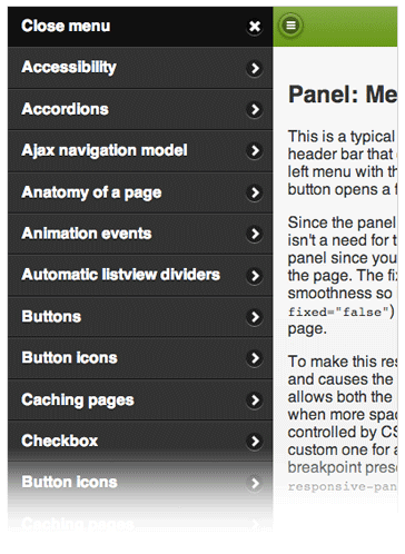
One of the most common mobile UI patterns we see right now are Facebook-style panels that open to reveal a menu, form or other content. We spent a lot of time prototyping different ideas and are really happy with our new panel widget. It offers a ton of flexibility. Panels can be positioned on the left or right of the screen and be placed flexibly in the HTML source order.
There are three different ways a panel can animate open. The default reveal display slides the page away to show the panel beneath, the push display animates both the panel and page, and the overlay display places the panel on top of the page. Panels can be closed by swiping, tapping onto the page, or hitting the Esc key on the keyboard.
To take this widget responsive, it's easy to add media queries to make the panel stay open at wider widths instead of auto-closing when you click on the page content. This makes this panel more like a collapsible column, like the folder list in a mail program. We've included a breakpoint preset to add this behavior by adding a class to the page container. Here's an example of a typical panel setup with a left nav panel and right panel with a form.
For such a simple looking widget, panel were really challenging to get right across all our platforms. We ended up going through four different re-factors leading up to beta in order to get the animations as smooth as possible and are really happy with the result. In the new docs, there are examples of how to apply custom panel styles and open panels on swipe.
New: Responsive tables
There are a lot of possible ways to handle tabular data in responsive designs. We've decided to tackle two different responsive table modes in 1.3, each with its own strengths and uses.
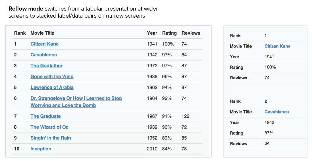
The reflow table mode swaps to a stacked label/data style presentation at narrow screen widths and best for situations where the content length is fairly long and comparing data across rows in a table is less critical. For example, a product or movie list might be a good choice for reflow mode.
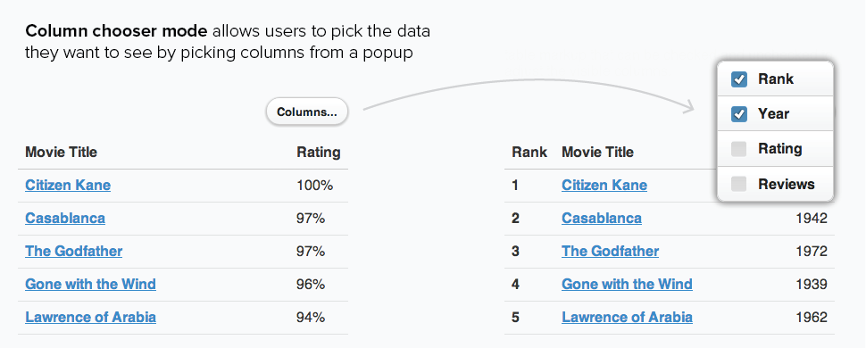
The column toggle table mode hides columns at narrower page widths according to a priority you set on each column as a sensible default to ensure that the table fits on-screen. A dynamically generated column chooser popup allows the user to select which columns they want to see for full control. This mode is best for situations where comparing data across rows and columns is critical. For example, a complex table of financial data might be a good choice for column toggle mode.
We've built some cool demos showing how you can customize these basic table tools to make a comparison chart or present complex financial data with grouped headers and more.
New: Range slider
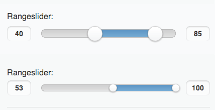
Adding support for dual handle sliders for collecting range values has been a popular request and we're happy to add this new widget in 1.3. The new dual handle range slider starts with a pair of HTML5 range inputs and essentially two sliders with a shared track. All the normal slider options work with ranges: mini sizing, theming, etc.
We've also refined the size and styling of the inputs that accompany sliders to make them integrate better visually and leave more room for the slider. The inputs are now mini sized with bold text and no border or spinner arrows (seen in desktop browsers).
All sliders now respect step values smaller than whole numbers which is great for scientific and financial applications that need inputs that capture values to the 0.1 or 0.01 level of accuracy. Slider behavior has been refined so dragging will snap to the closest step position to provide better feedback.
New: Responsive grids
The cornerstone of any responsive design are responsive grids. We believe that the best grid systems are content-specific and not something that can be easily generalized into a framework but for people using our simple grid blocks, there are now detailed instructions on how to create your own media queries to adjust grids at various breakpoints.
We're also shipping with a breakpoint preset that can be applied by adding a class to your grid wrapper. This will apply a CSS breakpoint at narrower screen widths that stack all the grid blocks instead of floating them. This is a simple way to make your grids a bit responsive and fit better on phones.
Navigate event and method
There are two new additions to the navigation functionality in jQuery Mobile. A navigate event that normalizes the URL alteration events hashchange/popstate, and a $.mobile.navigate method that allows users to receive extended traversal information in navigate bindings (eg, directionality).
The navigate event is a lightweight attempt to unify bindings to a browser's URL alteration events hashchange and popstate. It also handles differences in the way setting the hash on the location object interacts with the two browser events (ie, stop the world popstate triggering), and provides event hooks to control the event lifecycle.
The $.mobile.navigate method forms the bulk of the new functionality. By using the $.mobile.navigate method to do URL manipulation instead of doing it directly with the location object, replaceState, or pushState you get history management and support for both modes of URL state tracking. The history management provides a state object to navigate event bindings whether the browser supports the new history API or not. It also contains the logic to determine whether navigation is moving forward or back in the browser history.
Both the event and the method are available as modules apart from other navigation functionality in jQuery Mobile, with minor dependencies on other parts of the library. More info can be found in the navigation page and teh issue for this refractor.
Navigate API: Event and Method
Page transitions: Support for IE10/WP8
Our CSS keyframe animations were written with vendor prefixes to date, but we've now added non-prefixed keyframe rules to bring transition support for IE10/WP8 and all future browsers. This also required updating the 3D support feature tests.
Listview: two new ways to make into an auto-complete
Everyone loves the listview filter feature and we heard quite a few requests to make this work as an autocomplete. Rather than create a new widget, we found two clever ways to make the current listview more powerful.
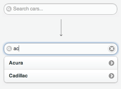
First, we've added the filter reveal feature makes is easy to build a simple autocomplete with local data. When a filterable list has the data-filter-reveal="true", it will auto-hide all the list items when the search field is blank and will display matching items as the user types into the search field. The data-filter-placeholder attribute can be added to specify the placeholder text for the filter. Any listview filter with a lot of items may be slow to perform on a mobile device so we recommend using this feature for a relatively small number of items.
To use the listview filter as an autocomplete that taps into remote data sources, you can use the listviewbeforefilter event to dynamically populate a listview as a user types a search query. This is useful when you have a very large data set like cities, zip codes, or products that can't be loaded up-front locally. Use the view source button to see the JavaScript that powers this demo.
We've added corner and shadow options for inset listviews for consistency with other widgets and made it possible to set theme on list dividers via the data-divider-theme attribute. On mobile devices, when using a listview filter, the submit button on the on-screen keyboard will now blur the input to dismiss the keyboard to improve usability.
Dialog: close button option for control
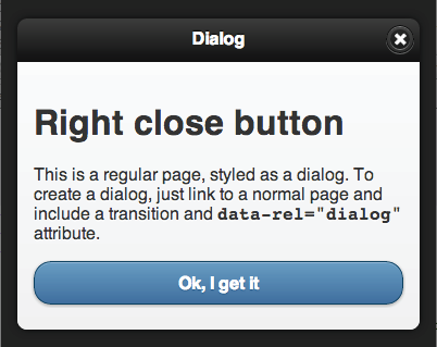
If the dialog has a header the framework will automatically add a close button at the left side of the header. You can now change the position by adding data-close-btn="right" to the dialog container.
If you don't want a close button in the header or prefer to add your own custom close button, you can use data-close-btn="none".
Dialogs now have a corners option like other widgets to control whether rounded corners are applied.
Popup: dismissible option
We've heard requests to prevent the click-out-to-close behavior of popups to make them modal. To address this, we've added a new dismissible option so you can add the data-dismissible attribute to a popup container. When set to false, the popup won't close when you tap outside it onto the page.
Inputs: clear button option, support for file inputs
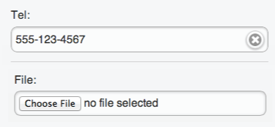
We've added a new feature to let you add the clear button we originally created for search inputs to any input type (text, date, number, etc.) by adding the data-clear-btn="true" attribute. The text for this clear button can be customized via the data-clear-btn-text="clear input" attribute. Search buttons have the clear button by default but can be controlled by this option. Note that this is available for all the input types except for textareas.
Now that file input types are becoming more supported by mobile platforms, we've added automatic styling for these as part of jQuery Mobile. Browser support for styling these is surprisingly good and even the clear button option seems to work with these on better browsers.
In addition, we've made lots of small improvements to inputs: fixed the height and alignment of text inputs on IE9/WP, textarea auto-grow now also works when you paste text, and text inputs now work much better with multibyte strings.
Selects: themable optgroups, header position support
If you're using selects with custom menus, we're fixed some focus issues and made optgroup themeable in custom menus via the new data-divider-theme option. We've also made selects work nicely inside headers when positioned with the ui-btn-left or ui-btn-right classes.
Button: programatic theme updates
It is now possible to change button's data-theme programatically via _setOption.
Collapsibles: corner option
We've added a new corners option for inset collapsibles and accordions (collapsible sets) to make this consistent with other widgets.
Fixed header improvements & extension
Fixed toolbars are tricky business with all the browser bugginess. Since 1.2, we've closed 37 fixed toolbar issues including the 1px jitter when scrolling, Android 2.x transition bugs, on-screen keyboard and input focus bugs, and iOS next/prev form controls causing the fixed header revealing itself.
Since the majority of these fixes are for older, but popular versions of Android 2.x and iOS, we've packaged these fixes and workarounds into an extension to fixed toolbars called fixedToolbar.workarounds.js that can be omitted in the download builder if you're targeting only newer mobile browsers to save bandwidth and complexity.
Controlgroup is now a widget
We've upgraded controlgroup from a function into a proper widget so it has a full set of options (mini, shadow, corners, etc.) and a create event to help with enhancement.
Less JS, More CSS
In 1.4, we're planning on dramatically simplifying the amount of JavaScript we use to modify markup or apply classes, and instead use forward-looking CSS techniques which will be more performant. In 1.3.0, we switched away from our fairly complex JS-based logic to apply corner classes and instead use CSS inheritance for corner styling. As part of this process, we have removed the corner classes (ex. corner-top, corner-bl) from theme.css since this can be done with CSS now and it saves us valuable bandwidth and complexity.
Removing these classes and JS logic yielded substantial savings: roughly 1k (gzipped) from the library. We look forward to much bigger changes like this in 1.4.0.
Icons: New icons, ability to switch color and remove the disc
We've had a lot of requests to add specific icons to our icon sprite and with the current sprite-based approach, we've been trying to keep the set pretty simple and make it easy to use 3rd party sets. However, we realized that we need the now standard "3 bar" icon to accompany the new panels to support people using these for menus. While we were at it, we added a edit icon (pencil) because this was a very popular request.
The theme system always had a white and black icon set but it required a bit of CSS to switch between colors. Now use class ui-icon-alt to switch from the white to black icons in the default theme (configurable via ThemeRoller). If you don't need the dark circle behind the icons, simply add the ui-icon-nodisc to the element or its container to remove the icon background. In keeping with our theme of using less JS, you'll notice both of these features are classes, not data-attributes to reduce the script overhead.
In 1.4, we're looking at re-vamping our theming and icon system and hope to be switching to SVGs with a PNG fallback which will make it easier to offer a larger icon set and maintain the best quality since we will be working with vectors.
Swipe event extensibility
The swipe event can now be extend to add your own logic or functionality. The following methods can be extended:
$.event.special.swipe.start- This method recieves a touchstart event and returns an object of data about the starting location.$.event.special.swipe.stop- This method recieves a touchend event and returns an object of data about the ending location.$.event.special.swipe.handleSwipe- This method recieves the start and stop objects and handles the logic for and triggering for the swipe events.
We've also been building some real-world swipe demos like the swipe page nav and the swipe listview item to delete.
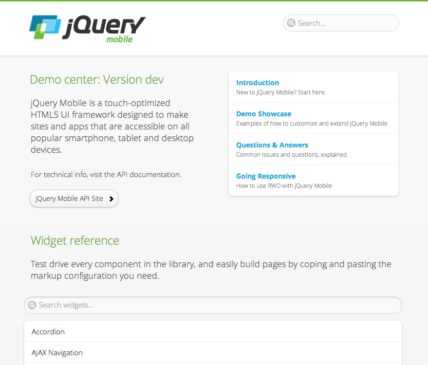
New demos site: Launching today for 1.3.0
The demos and docs grew organically out of our original development work for 1.0 and it was easy to find the information you needed. With 1.3, we've been hard at work building whole new API site (see below) and companion demo center.
The widget reference is designed to make it easy to quickly browse every widget and variation and grab the code via the an integrated 'view source' tool. There is an demo showcase that shows you how to customize and extend the framework and a Q&A section that covers common issues and solutions.
Navigation is now much improved with a navigation panel with quick access to all widgets, a global search, and a panel to jump to a section within a page. If you are interested in helping us improve the demos by contributing fixes, demos or Q&A pages, please let us know or submit a pull request.
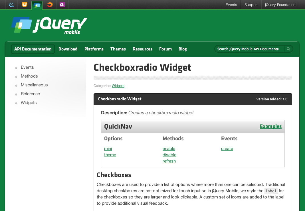
New API site: Launching today for 1.3.0
Our current demo and docs format has mixed reviews: some folks like our simpler, tutorial style docs while others have said that it's hard to just get all the info they need quickly.
To address this, we've been working hard on porting all our docs over to the same API style API format as jQuery core and UI. This will provide a complete reference for every option, method and event in one centralized, searchable place. Since the docs are all XML-based, you'll be able to remix them in any way you want for complete flexibility.
We'd like to take a moment to thank team member Anne-Gaelle Colom who has spent an incredible amount of time over the last year building these docs from scratch and we really appreciate her dedication.
The new API docs are in beta now and when we hit 1.3 final, we're going to switch over to those as our authoritative place for API info. Our plan is to retire the current docs and have an all-new demos site to accompany the new API docs.
Support for jQuery 1.9.1 (and 2.0.0)
jQuery Mobile 1.3.0 supports versions of jQuery core 1.7.2 - 1.9.1 and we're actively testing the upcoming 2.0 version too. We will be keeping in sync with their releases to let you take full advantage of the new goodness.
Nested listviews: Now deprecated, will be removed in 1.4.0
We are depreciating the nested list feature now and will be dropping support for this in 1.4.0. Nested lists auto-generate pages based on nested UL structures but these have a number of important drawbacks. First, these generated pages complicate the AJAX navigation system and introduce a wide range of edge cases (and bugs) that make it impossible to maintain with our navigation model. Second, these dynamic pages are of limited value because they can't be controlled without introducing a templating engine so they are not flexible enough to be useful without adding a lot of functionality.
The same effect can be achieved by creating a multi-page document which give you full control of the page layout and styles. The nested listview plugin will be removed in 1.4.0 and moved to an external repo for those that still want to access the code.
Supported Platforms: Always Expanding
Our test lab has grown to over 70 phone, e-readers and tablets over the past few years. Luckily, our dedication to web standards and feature detection has meant that most new devices "just work" when they arrive. As of 1.3.0, we've added a few notable A grade platforms into testing rotation: BlackBerry 10, IE10 and Microsoft Surface RT, WP7.8, Kindle Fire HD (7" and 10"), and more.
Upgrade notes
- We are depreciating the nested listview feature and will be dropping support for this in 1.4.0.
- We have removed the corner classes (ex. ui-corner-top, ui-corner-bl) from theme.css since this can be done with CSS now and it saves us valuable bandwidth and complexity.
- All links containing a hash were truncated at the hash and then appended to the current base tag value. This was a blanket solution for dialogs and nested listviews. As of 1.3.9, we will now only apply this to dialogs and nested listviews by looking for &ui-page and &ui-state. All other urls will be allowed to pass through normally.
- AJAX nav - iOS 4 will now receive hash-based navigation only because of it's buggy history implementation.
- We changed the media query for the HD icon sprite to include devices with a slighty lower resolution which should make graphics crisper in some devices.
- Inputs are now always wrapped in a div. This fixes the alignment of full width inputs on IE7/8 and WP7 + input type color on Chrome
- Slider: we modified the style of the input next to the slider to make it mini sized, bold font-weight, no border and no spinner.
- Fixed headers: an optional extension for browser-specific workarounds is available.
- Multipage documents result in a sluggish back button performance on IE7 due to browser issues. The back button still works, but you have to click it several times to go back a single step in the history. The further you try to go back in history the more work you have to do for a single backwards step. Single-page AJAX-linked documents are a better approach if IE7 support is essential.
Change Log for 1.3.0
Button
.buttonMarkup() doesn't work correctly while binding with the button itself (Issue #3637) - Track addition/removal of up/down/hover classes to reconstruct button state during re-enhancement
Button inner elements corner styling inheritance
Changing button's data-theme programatically (Issue #4317) - Implement _setOption()
Do not assume that a button's className will contain only classes assigned by buttonMarkup()
IE9 , if custom SELECT button is on the right border of the window, it expand the select menu over the whole window width
(Issue #4577) - Button: width auto for div's with class ui-btn-text to prevent custom selects breaking on IE.
No need to add class ui-btn-corner-all to inner element because it inherits the border-radius.
Prevent margin top/bottom on selects, checkboxes and radio buttons with class ui-btn-left/right.
Checkboxradio
Adding new behaviour to widget definition
Checkboxradio not losing its icon when added to controlgroup post-enhance (Issue #5264) - Checkboxradio: hiding the icon in horizontal controlgroups with CSS instead of JS.
.live() and checkbox labels
(Issue #2383) - Checkboxradio: allow vclick event to bubble.
Remove fieldset from being a form
Request: mini-Option in checkboxradio & textinput (Issue #4070) - Allow to set option mini programmatically.
Restore active state for buttons in horizontal controlgroups
Turn off icon if part of a horizontal controlgroup
Use .buttonMarkup() to update icon instead of class manipulation
Collapsible
Added info and demo of collapsible coner styling to the docs.
Added info and demo of corner styling to the docs.
Added option corners to option page and data- attribute reference.
Added option corners to option page and data- attribute reference.
Added pure CSS corner styling for collapsible and collapsible set
Adjusted selector to avoid problems with nested collapsibles.
Adjusted to CSS for collapsibles without icon.
Also add "themed-content" class to non-inset collapsibles for collapsible lists border styling.
Collapsible iconpos via mobileinit differs from documentation (Issue #4899)
Maintain ui-first-child and ui-last-child during refresh()
Make option corners work on a set.
Set icon options according widget factory. Use preferences of collapsible set for icon options.
Update first/last classes using common behaviour
Ui-first-child/ui-last-child for corner styling
Controlgroup
Added missing selector for corner styling
Allow controlgroup buttons to be wrapped in a LI
Container() function tells people where to put their buttons
Changed selectors for controlgroup corner and border styling to make mixed controlgroups work
Changed selectors for negating border-radius on buttons in controlgroups
Changed selector from class -last to :last-child for border bottom on last controlgroup item.
Cross browser border styling solution for controlgroups
Do not assume checkboxradio widget is defined
Fixed issue with selects in horizontal controlgroup being displayed as block on IE7.
Hide labels of inputs type button as well when in a controlgroup.
Had wrong default value for option excludeInvisible
Moving flipClasses() into the widget following a suggestion by johnbender
New option: "corners": boolean: default: true
Re-introduce refresh() method, to mark first and last visible child
Refresh the child checkboxradio widgets when the controlgroup type (horizontal/vertical) changes
Smarter selectors for controlgroup corner styling
Turn off shadow for children, but not if ui-focus is present
Ui-first-child/ui-last-child for corner and border styling
Update first/last classes using common behaviour
Use enhanced buttonMarkup corner-encoding ability instead of setting corner classes manually -- Fixes #3635
(Issue #3635) Use enhanced buttonMarkup corner-encoding ability instead of setting corner classes manually
Was using wrong calling convention for this._super()
Dialog
Added info and demo of option closeBtn to the docs.
Added info and example for option corners.
Added option corners for dialogs
Added option corners to option-page and data- attribute reference.
Append close button to first found header to prevent a close button being added to popup on same page as well. Fixes #5382.
(Issue #5382) Append close button to first found header to prevent a close button being added to popup on same page as well.
Attach pagebeforeshow handler using ._on(). Fixes #2215. (Issue #2215) - Dialog: Attach pagebeforeshow handler using ._on().
Hide X/close button option on Dialogs
(Issue #3886) - New option: closeBtn: default "left": possible values: "left","right","none"
Prevent dialogs re-using initial ui state from going back
Make sure close button inherits header theme.
Missing round corners
(Issue #4277) - Corner styling for dialog and popup header/content/footer. Also fixes #4277
Removed code that removes active state from buttons on pagehide. Fixes #5111.
(Issue #5111) Removed code that removes active state from buttons on pagehide.
Events
Modified event dispatching which was impacting proper dispatching of scrolling events under jQuery 1.9.0. Thanks erikyuzwa!
Fieldcontain
Cannot use $.mobile namespace here because these files do not depend on core
Changed from 450px to 28em breakpoint. Fixes #5276
(Issue #5276) - Changed from 450px to 28em breakpoint.
File Input
File input support
(Issue #5050) - Added file inputs to the auto init so they now receive consistent theme styling.
Fixed toolbars
Fixed incorrect event binding in _on (Issue #5487) - Page padding should be applied before transition starts
Fixed header jumps around when iOS keyboard disappears (Issue #5332)- added iOS6 to iOS workarounds
Fixed incorrect event binding in _on (Issue #5487) - Page padding should be applied before transition starts
Fixed header jumps around when iOS keyboard disappears (Issue #5332)- added iOS6 to iOS workarounds
_destroy()
(Issue #3880)
- FixedToolbar: change destroy to _destroy per ui 1.9 upgrade guide widget was not being destroyed previously. Fixes #3880 - fixedToolbar _destroy()
Added extension with browser specific workarounds
(Issue #3748, Issue #4113, Issue #4250, Issue #4337, Issue #4410)
- Added extension with browser specific workarounds Fixed: #3748 Android 2.x: Page transitions broken when fixed toolbars used #4113 Header and footer change their position after keyboard popup - iOS #4250 Persistent footer instability in v1.1 with long select lists in Android 2.3.3 #4337 Fixed header problem after scrolling content on iOS and Android ##4410 Footer navbar moves up when clicking on a textbox in an Android environment
Changed to reset padding Vs. setting to 0 to maintain user set page padding.
Declaring _thisPage explicitly -- thanks arschmitz
iOS 6 fullscreen: page can be panned left and right (wider than the screen?) (Issue #5155) - Fixed toolbars: higher specifity for border left and right 0 rule.
Make sure absolute positioning is in effect for fixed toolbars while open
Move page handlers to the widget prototype level and attach them using ._on()
Moving through form in Mobile Safari with "Next" and "Previous" system controls causes fixed position, tap-toggle false Header to reveal itself
(Issue #4724) Wait for stack to unwind before showing tollbars on focusout to make sure we have not jumped to another input. Fixed #4724 - Moving through form in Mobile Safari with "Next" and "Previous" system controls causes fixed position, tap-toggle false Header to reveal itself
Only fix toolbar conflicts on push and reveal
Persistent headers and footers placed under content after transition
(Issue #4019) - Persistent headers and footers placed under content after transition - Header and footer were both being appended broke out to prepend header and append footer.
Positioning for overlay should allow for fixed positioning toggles as usual
Prevent the content padding adjustments for fullscreen from being applied to popups.
Revert to using .one(). Re: #5361
Switched to double quotes for consistency
This should be the last change needed for 2.3's fixies
Transitions with Pages that have Fixed Toolbars (Issue #4424) - Transitions with Pages that have Fixed Toolbars - Remove class in class after transition completes
Updating description metadata with reference to new workarounds extension
When you call destroy on the fixedToolbar widget it does not restore page padding
(Issue #5261) added logic to set page padding back to 0 on destroy. Fixed #5261 - When you call destroy on the fixedToolbar widget it does not restore page padding
Forms
Grid
Responsive Grid
(Issue #4955) Added responsive docs page and "ui-responsive" breakpoint preset.
Icons
Added new bars (nav) and edit icons
Corrected 18px black sprite size and icon position
Listview
Added option corners and shadow for listviews
Added parameters to _addFirstLastClasses()
Adjusted min-height of list item with thumbnail.
Avoid filtering twice for ":visible"
Bind to input event as well. Fixes: #2834.
Create remote auto-complete demo using new listview filter hooks
(Issue #5096)
- https://github.com/jquery/jquery-mobile/issues/5096
Cross browser listview border bottom on last item solution
Fix list-dividers use data-theme attribute first
Iphone : Go button does not close the keyboard with Data filter
(Issue #3303) - Blur the search field on submit
List autodividers (Issue #5197) - use trim() to avoid issues with newlines and spaces in markup. Thanks @demonslord!
New option to start with all items hidden when search input in blank (Issue #5090) - New option to start with all items hidden when search input in blank Please meet: data-filter-reveal
Option filter can't be set programmatically
(Issue #5245) - Listview: make it possible to set option filter programmatically.
Prevent onKeyUp handler to be called twice for the same value
Remove functions and calls related to corner manipulation
Replaced class ui-li-last by :last-child selector
Restored left/right border on list dividers
Title attribute of a split button pulls in extra spaces (Issue #5182) Title attribute of a split button pulls in extra spaces. Cause: entire text node is copied for the title attribute, including any leading or trailing spaces. Solution: Apply $.trim() to the text node value before assigning to the title attribute. Files Impacted: listview.js
Ui-first-child/ui-last-child for corner and border styling
Update first/last classes using common behaviour
Use the new class to select the themed collapsible content
Navigation
Fix the extra hidden inputs being added on click (Issue #5593 and #5590) - Append value of named button to form data if the form was submitted by a click of that button without resorting to a hidden input.
Incompatibity with jQuery.noConflict() (Issue #5448) - Fixed by wrapping the path helper module in an anonymous func.
Nav incorrectly adding an empty hash in Chrome (Issue #5442)
Disabling hashListeningEnabled in 1.3 beta doesn't work (Issue #5445)
Add to history without modifying the location.hash when history is turned off
Make it possible to disable history in dialogs (Issue #5465) - Retreat in the urlHistory stack when closing with history disabled.
Add active class to submit button if form will be handled via AJAX. Addresses parts of #5009.
Add config to disable base changes all together
Add parameter calculateOnly to getAjaxFormData when the data itself is not important
Address issue with opera and dialog back button
Allow users to provide state to further normalize the navigation events
Basic hash assignment handling
Correct query param preservation on urls
Corrected first pass at query params to embedded pages
Create, store, and pass the absolute url in all page lifecycle events on the trigger data object
Default to the base href when dynamiceBase is disabled
Disable base tag reset on stale dialog url
Dynamic Page Generation & Page Refresh (Issue #5085) - first pass at supporting query params in the hash
Factor out calculation as to whether form submit will happen over AJAX
Fix initial state for alternate init case
Fix for pagechange value and test of 3 page change events
Include the navigate method to do history tracking and state inclusion for hashchange
Leading whitespace in href results in a synchronous load, when async is desired
(Issue #4882) - Changed urlParseRE to ignore space at beginning. This is expected behavior in browsers. This used to result in pages changing to destination.html instead of the now destination.html
LoadPage: When loading a blank page, do not end up with <div data-role="page">undefined</div>
Merge the search params when squashing makes absolutely no sense since it ruins the new url
Move event blocking to navigator object
Move navigate events under events directory
Move navigation and history tracking into objects
Navigator object may exist in browser like FF
No history entry is added when the hash handling is turned off
Path.getDocumentUrl is defined twice
Prefer backward history movement, tests to accompany
Provide history and directionality to popstate based navigate event
PushState is broken on certain browsers (Issue #5414) - address browsers that don't fire popstate on hash assignment
Rename parameter for getAjaxFormData ($this -> $form)
Save the initial hash key in urlHistory
Split out hash monkeying from the navigate method for testing
Split out navigation objects into their own files
Split out path for future direct reference
Strip initial hash character off initialDst
Support disabling pushstate with option
The first urlHistory entry cannot be a stale dialog hash state
Use existing api property name for consistency
Use originalEvent in preference to from
Vclick handler: Do not add active class if already added
Vclick handler: Do not avoid removing active class off button that already has it
Wait for DOM ready in addition to nav ready before listening for "navigate" events
Page
Dialog themed incorrectly when re-created (Issue #2215) - Attach handlers using ._on().
Orientation Change
Added $.mobile.iosorientationfixEnabled option, which can be disabled at mobileinit
Disabled the iOS orientationchange fix in iOS6+ as it's no longer needed
Panel
Make sure active state is applied to and removed from buttons in header (Issue #5588)
Set min-height when panel is open (Issues #5456 and #5471). Prevents vertical scrollbar.
Panel should close after, and not during, page animation (Issue #5480) - changed event listener to pagehide. Thanks jhogervorst!
Use extend in the create method also exposed resetActivePageHeight in mobile.navigation so panel can use it.
Chrome Issue: CSS column-count and data-role="panel" (Issue #5508) - Bit more hardware acceleration of content-wrap required for Chrome.
Only apply active state to button styled links, not standard links
Only set page theme to panel theme for reveal and push mode.
Auto-close panel when clicking on a link in the panel with data-ajax="false".
Popup
Popup over selectmenu focus issue (Issue #5519) - Cleaned up focus restriction handling.
Prevent opening a panel while another panel is already open (Issue #5510) - Don't start opening a panel before other panels are closed.
Set default theme for panel to "c"
Fixed incorrect fixed toolbar width and position if animate is false.
Chrome popup stops launching if transition is "slideup" (Issue #5094) - Re-introduce interruptible transitions
Data-tolerance="0" did not work.
Do not pass link into open() because it is not used there.
Flatten widget methods: move timeout that triggers focus and "popupafteropen" to the widget level
Generate history entry when opening from an initial URL containing a hash key
Get rid of _globalHandlers and use ._on() instead
Get rid of a bunch of "self" declarations
Made images inherit the corner styling when they are the only child in the popup.
Make sure close() only acts if the popup on which it is called is the currently open popup
Pass placement through "popupbeforeposition" to allow handlers to modify the popup positioning
Popup widget depends on selectmenu css
(Issue #5217) - Renamed class ui-selectmenu-hidden to ui-popup-hidden
Popup("destroy") never ends
(Issue #5244) - Avoid infinite recursion by detach()ing the payload from the container before attempting to put it back to its original place in the DOM (which may not exist, if the popup was created based on a detached element)
Popup disappears on iDevice with orientation change in standalone mode (Issue #5153) - Initiate resize expectation during orientationchange
Popup Reappears after closing when textarea input field expanded on iOS 6 (Issue #5157) - Only rapid-open the popup if it is open
Popup remove firing popupafterclose
(Issue #5123) - When destroying a popup, run close() before un-enhancing if it is the currently active popup
Rename function _maybeRefreshTimeout to _expectResizeEvent
Scroll to top when popup is closed on iOS (Issue #5334) - Record scrollTop upon open and close, and restore it upon hashchange.
Systematically merge link options and widget options during _open().
There is a case when bindings must not be released during _closePopup()
Try to keep keyboard focus inside the popup while it's open (Issue #5130) - Restrict focus to elements inside the popup
Unable to close popup in Android 2.3 if transition was used when opening it (Issue #5189) - Correctly handle the case when the fallback transition is "none" -- Fixes #5189
Unbind nav and click delegate events as soon as the process of closing the popup starts.
Rangeslider
Missing argument in function _dragFirstHandle - exception was thrown in Firefox. Thanks stforek!
Missing argument in function _dragFirstHandle - exception was thrown in Firefox. Thanks stforek!
New input styling, keep inputs always next to slider.
Select
Get rid of hasAttribute calls. (Issue #5506) Thanks erikyuzwa.
Get rid of hasAttribute calls. (Issue #5506) Thanks erikyuzwa.
Add a check to not add ui-popover-container if it's already on the page
(Issue #4661) - Implement _destroy()
Adding new behaviour to widget definition
Android 4.1 with Chrome - Select on footer with data-position="fixed" no response
(Issue #5140) - Select menus inside elements in Android 4.1 Chrome now work after scrolling.
Can't open popup from select menu.
(Issue #5254) - Give IDs to the popup and the dialog, and open popup/dialog via nav -- Fixes #5254
Custom select menu header corner styling (Issue #5215) - headers of custom select menus shouldn't inherit the popup corner styling. Fixes #5215.
Mark as closed after dialog closes - Re: #5195 - Thanks martenbohlin
Must depend on navigation to open.
Prevent-focus-zoom doesn't work :(
(Issue #5333) - improved preventFocusZoom
Select data-overlay-theme not changing from 'a' past jqm1.1.1
(Issue #5051) - fixed listbox overlayTheme regression. Select data-overlay-theme not changing from 'a'
Select menu refresh() does not refresh popup title (Issue #5275) - Update placeholder during _buildList().
Select-element with class ui-btn-left inside header-div has no width (Issue #5073) - Remove class ui-btn-left/right from the select element itself during enhancement. Fixes #5073
The preventFocusZoom option check needs to be insde the event binding.
Slider
Actually include disabled changes mentioned previous commit
Adding new behaviour to widget definition
Fix incorrect variable name which caused error in firefox
Flip toggle switch broken on IE7
(Issue #5391) - unset slider handle top offset for flip toggle switch.
Position input next to label on small screens and make slider full width.
Removed CSS for regular sized input. Became superfluous now that the input is always mini sized.
Removed JS and CSS for option inline that does not exist.
Slider fill the whole width? (Issue #5045) - Made the slider and input together fill full width. Changed class ui-slider-mini to ui-mini for consistency.
Unset ui-btn-inner border-top for mini flip toggle switch handle because of the negative margin.
Wrap input, slider, and label in a div for styling
Support
Added unprefixed properties to transitions CSS for IE10 support.
Adds test for unprefixed `perspective` property."
Fix cssTransition support test (properly this time) for ie < 10
Fix cssTransition test to kick out all ie versions < 10
Fix cssTransition test to kick out all ie versions < 10
Opts IE9 (back) out of page transitions.
Switch to $.mobile.browser.oldIE FIX: #4881 - Move $.mobile.ie to $.mobile.oldIE
Update to $.mobile.browser.oldIE
Update to latest version of support
Swipe
Scrolling up and down causes swipe event (Issue #2328) - Swipe Event: made it possible to hook to the start and stop objects and swipe event handler to allow custom implementations and extensions. Fixes #2328 - Scrolling up and down causes swipe event
Table
A data-mini button in a data-role table doesn't work (Issue #5531) - reset line-height for buttons in table
Bug with Table reflow on Safari
(Issue #5380) - Fixes table rendering when switching between breakpoints in Safari <= 5. Closes 5380.
Textarea
On pasting to a textarea, no auto grow occurs until one taps into and starts editing
(Issue #4854) - Make textarea autogrow also work on paste and with multibyte chars. Fixes #4854.
Textinput
Text Input had too much padding on the right (Issue #5470) - Only set more padding right if option clear button is true
The textinput('enable') method not working properly (Issue #5447)
Text Input had too much padding on the right (Issue #5470) - Only set more padding right if option clear button is true
The textinput('enable') method not working properly (Issue #5447)
Adjusted clear button position for mini sized.
Adjustments to fieldcontain CSS
Changed option name to clearBtnText for consistency
Clear button not optional for Search.
Clear input button for text inputs
(Issue #1834) - modified css to add clear button to input type text, deprecated clearSearchButtonText, removed duplicate code.
Fixed box-sizing for text input with clear button.
Fixed margin for ui-mini with clear button.
Fixed right padding for text input with clear button.
Fixed the width of text input element with clear button.
Fixed the disabled styling of textinput elements.
IE9 - the descender (tail) part of some lowercase letters such as g, p, q or y are clipped
(Issue #5307) - added min-height to make text fit on IE/WP.
No option clearBtn for textarea, padding on input instead of wrapper, full width inputs.
Prevent the slider number input from being wrapped in a div.
Request: mini-Option in checkboxradio & textinput
(Issue #4070) - Allow to set option mini programmatically.
Slider number input should never get a clear button
Text input placeholder text not grayed out in Firefox (Issue #5166) - Modify placeholder text color in Firefox to use standard in FF 15+, add important to resolve issue in build process where other CSS overrides :-moz-placeholder setting later on., use input prefix for -moz-placeholder fix instead of important override.
Toggle clear button on input event as well.
Width of textinput depends on its type (Issue #5131) - add margin 0 for webkit-inner-spin-button/webkit-outer-spin-button to resolve android 4.1 width issue for type=number fields, remove webkit-inner-spin-button and webkit-appearance:none as they caused an unwanted change in Chrome.
Theme
Make it easy for people to override the icon color by just adding the ui-icon-alt class to the element or a container.
Added ui-icon-nodisc class to make it easy to have an icon without background.
Removed any remaining blur on text shadows for better performance
Slightly lightened up the drop shadow opacity to remove muddiness
Replaced icon sprite and update and set icon bg position for both SD and HD.
Cleaned up SD icons for clarify and alignment
Slidefade CSS: add two missing semicolons. This enables using the CSS as SCSS without compile errors.
Fieldcontain CSS
(Issue #5277) - changed class ui-br to only set border color and style. Border width is set in structure CSS (fieldcontain).
Removed superfluous corner classes
Widgets
Moving references to widget instances to the new namespaced key
Touch events
Modified event dispatching which was impacting proper dispatching of scrolling events under jQuery 1.9.0. Thanks erikyuzwa!
Download
CDN-Hosted JavaScript:
- Uncompressed: jquery.mobile-1.3.0.js (useful for debugging)
- Minified: jquery.mobile-1.3.0.min.js (full library, ready to deploy)
CDN-Hosted CSS:
- Uncompressed with Default theme: jquery.mobile-1.3.0.css (useful for debugging)
- Minified with Default theme: jquery.mobile-1.3.0.min.css (full library, ready to deploy)
- Uncompressed structure without a theme: jquery.mobile-1.3.0.css (useful for theme development)
- Minified structure without a theme: jquery.mobile-1.3.0.min.css (full library, ready to deploy)
Copy-and-Paste Snippet for CDN-hosted files (recommended):
<link rel="stylesheet" href="http://code.jquery.com/mobile/1.3.0/jquery.mobile-1.3.0.min.css" />
<script src="http://code.jquery.com/jquery-1.8.2.min.js"></script>
<script src="http://code.jquery.com/mobile/1.3.0/jquery.mobile-1.3.0.min.js"></script>
ZIP File:
If you want to host the files yourself you can download a zip of all the files:
- Zip File: jquery.mobile-1.3.0.zip (JavaScript, CSS, and images)
Microsoft CDN hosted jQuery Mobile files:
Fork jQuery Mobile on GitHub
https://github.com/jquery/jquery-mobile
Platform support in 1.3.0
jQuery Mobile has broad support for the vast majority of all modern desktop, smartphone, tablet, and e-reader platforms. In addition, feature phones and older browsers are supported because of our progressive enhancement approach. We're very proud of our commitment to universal accessibility through our broad support for all popular platforms.
We use a 3-level graded platform support system: A (full), B (full minus Ajax), C (basic HTML). The visual fidelity of the experience and smoothness of page transitions are highly dependent on the CSS rendering capabilities of the device and platform so not all A grade experience will be pixel-perfect but that's the nature of the web.
* Note: If jQuery core 1.8+ is used with jQuery Mobile, iOS 3.x and BB5 are re-graded to C level support because core dropped support for methods these platforms need for full functionality.
A-grade - Full enhanced experience with Ajax-based animated page transitions.
- Apple iOS 3.2*-6.1 - Tested on the original iPad (4.3 / 5.0), iPad 2 (4.3 / 5.1 / 6.1), iPad 3 (5.1 / 6.0), iPad Mini (6.1), 3GS (4.3), 4 (4.3 / 5.1), and 4S (5.1 / 6.0), and 5 (6.0)
- Android 2.1-2.3 - Tested on the HTC Incredible (2.2), original Droid (2.2), HTC Aria (2.1), Google Nexus S (2.3). Functional on 1.5 & 1.6 but performance may be sluggish, tested on Google G1 (1.5)
- Android 3.2 (Honeycomb) - Tested on the Samsung Galaxy Tab 10.1 and Motorola XOOM
- Android 4.0 (ICS) - Tested on a Galaxy Nexus. Note: transition performance can be poor on upgraded devices
- Android 4.1 (Jelly Bean) - Tested on a Galaxy Nexus and Galaxy 7
- Windows Phone 7.5-7.8 - Tested on the HTC Surround (7.5), HTC Trophy (7.5), LG-E900 (7.5), Nokia Lumia 800 (7.8)
- Blackberry 6-10 - Tested on the Torch 9800 (6) and Style 9670 (6), BlackBerry® Torch 9810 (7), BlackBerry Z10 (10)
- Blackberry Playbook (1.0-2.0) - Tested on PlayBook
- Palm WebOS (1.4-3.0) - Tested on the Palm Pixi (1.4), Pre (1.4), Pre 2 (2.0), HP TouchPad(3.0)
- Firefox Mobile 18 - Tested on Android 2.3 and 4.1 devices
- Chrome for Android 18 - Tested on Android 4.0 and 4.1 devices
- Skyfire 4.1 - Tested on Android 2.3 device
- Opera Mobile 11.5-12: Tested on Android 2.3
- Meego 1.2 - Tested on Nokia 950 and N9
- Tizen (pre-release) - Tested on early hardware
- Samsung Bada 2.0 - Tested on a Samsung Wave 3, Dolphin browser
- UC Browser - Tested on Android 2.3 device
- Kindle 3, Fire, and Fire HD - Tested on the built-in WebKit browser for each
- Nook Color 1.4.1 - Tested on original Nook Color, not Nook Tablet
- Chrome Desktop 16-24 - Tested on OS X 10.7 and Windows 7
- Safari Desktop 5-6 - Tested on OS X 10.8
- Firefox Desktop 10-18 - Tested on OS X 10.7 and Windows 7
- Internet Explorer 8-10 - Tested on Windows XP, Vista and 7, Windows Surface RT
- Opera Desktop 10-12 - Tested on OS X 10.7 and Windows 7
B-grade - Enhanced experience except without Ajax navigation features.
- Blackberry 5.0*: Tested on the Storm 2 9550, Bold 9770
- Opera Mini 7 - Tested on iOS 6.1 and Android 4.1
- Nokia Symbian^3 - Tested on Nokia N8 (Symbian^3), C7 (Symbian^3), also works on N97 (Symbian^1)
- Internet Explorer 7 - Tested on Windows XP
C-grade - Basic, non-enhanced HTML experience that is still functional
- Internet Explorer 6 and older - Tested on Windows XP
- iOS 3.x and older - Tested on original iPhone (3.1), iPhone 3 (3.2)
- Blackberry 4.x - Tested on the Curve 8330
- Windows Mobile - Tested on the HTC Leo (WinMo 5.2)
- All older smartphone platforms and featurephones - Any device that doesn't support media queries will receive the basic, C grade experience

Great new features & widgets. Can’t wait for 1.4. Keep up the great work.
great, like it, thank u for upgrade….
I missed tables with pagination, titles fixed, with scroll… and a window with horizontal scroll
Awesome….Just about to try it out.
i love the new autocomplete… how about load more button ??
Thanks for the great release. The file size is wrong:
“Minified and Gzipped: jquery.mobile-1.3.0.min.js (24KB, ready to deploy)”
It’s closer to 40kb. I have to get my hands on an old c-grade device and check out load times. JQuery and JQuery mobile together are about 200kb uncompressed!
Great News!
also jqm 1.3 work with latest jquery ? 1.9.1
Congratulations to the whole team for their excellent work in the new version – JQuery Mobile is the best of the best…
Great news.. Is this not tested on Windows Phone 8 ? I would expect it as a A-Grade device, but I do not see it in the list. But in any case THANKS for all the work and the massive amout of fixes…
I was very excited about panels. But it turns out they can’t make it outside a page. Most of the time, we want the same panel for every pages, isn’t it odd to copy/paste it inside each page ?
Great news.
(function ($, undefined) {
$.fn.subpage = function (options) {
$(document).bind(
“pagechange”,
function () {
var forword = $.mobile.urlHistory.getNext();
if (forword) {
var dataUrl = forword.url;
var forwordPage = $.mobile.pageContainer
.children(“:jqmData(url='” + dataUrl + “‘)”);
if (forwordPage) {
forwordPage.remove();
}
}
$.mobile.urlHistory.clearForward();
});
};
$(document).bind(“pagecreate create”, function (e) {
$(“:jqmData(role=’page’)”, e.target).subpage();
});
})(jQuery);
function is used delete data-dom-cahe page,
ver 1.2.0 is ok
but i upgrade ver 1.3.0 ,it’s error.
选择信息分类
$(“#Pb_Sort h3”).html(decodeURIComponent(name));
$(“#Pb_SortSet”).collapsibleset(‘refresh’);
it can’t refresh
We love what you guys/gals are doing. The new features opens up so many possibilities. It’s just simply great!
Amazing features…Some more should be there now like iScroll, Pull to Refresh, Auto Page Fetch etc.
http://view.jquerymobile.com/1.3.0/ is down? “404 not found”
First of all… I love this framework…
But I have to comment regarding the supposed ‘autocomplete’ feature of the list view…
Seriously .. do you guys have any idea what an typeahead/autocomplete does? The user starts typing.. the list filters (so far so good) Then the user chooses an option, and the contents of which populates the input field.. and then the list goes away! It does not sit there like a dead link.. or navigate the user to another page.. Seriously I can’t even get the contents of the input field, close the filter list or anything.. please KISS!
What if anything are you doing about improving performance for PhoneGap targeted apps? Googling JQuey Mobile PhoneGap Performance yields a number of concerning posts citing poor performance in PhoneGap / Cordova. A related post addressing these concerns would be very helpful as I would prefer to use this over Sencha Touch.