Designs
Originally published at jquerymobile.com/designs/.
The jQuery mobile design team is actively working on designing a unified UI system for mobile-optimized widgets and layouts, and architecting a new version of the ThemeRoller tool to support the new theme system. Follow our progress and join the conversation on the jQuery Mobile planning wiki
Initial designs - August 11, 2010
The design team has developed an initial set of design concepts that explore how we can develop a touch-friendly design language that can be shared across both mobile and tablet form factors. Below are the latest versions of the following design mockups:
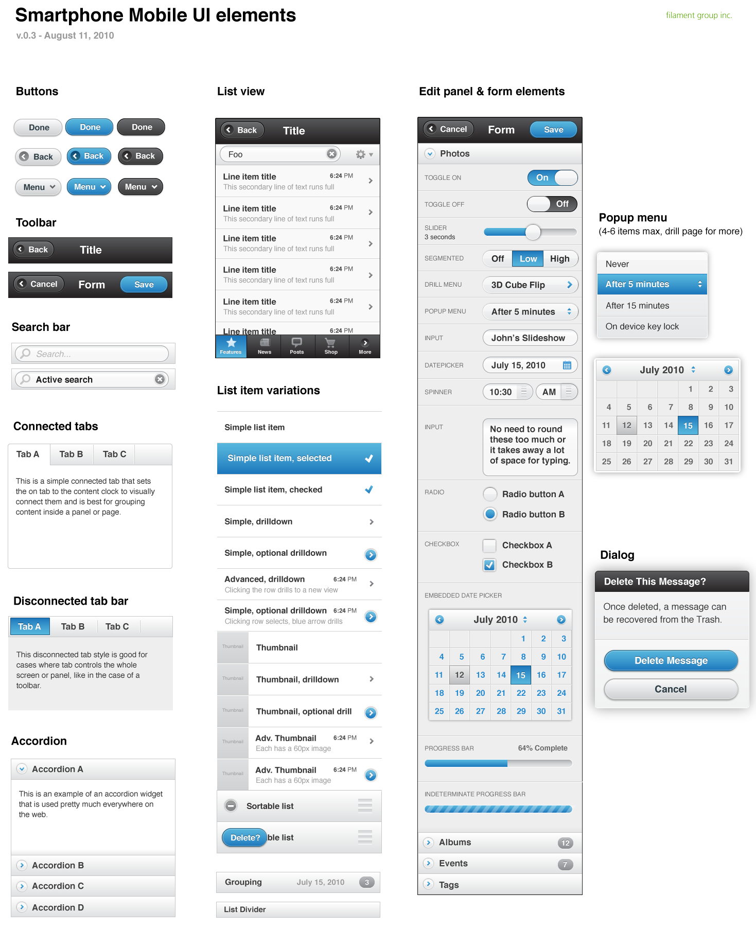
- Smartphone UI elements - core layouts and widgets we will focus on in this effort
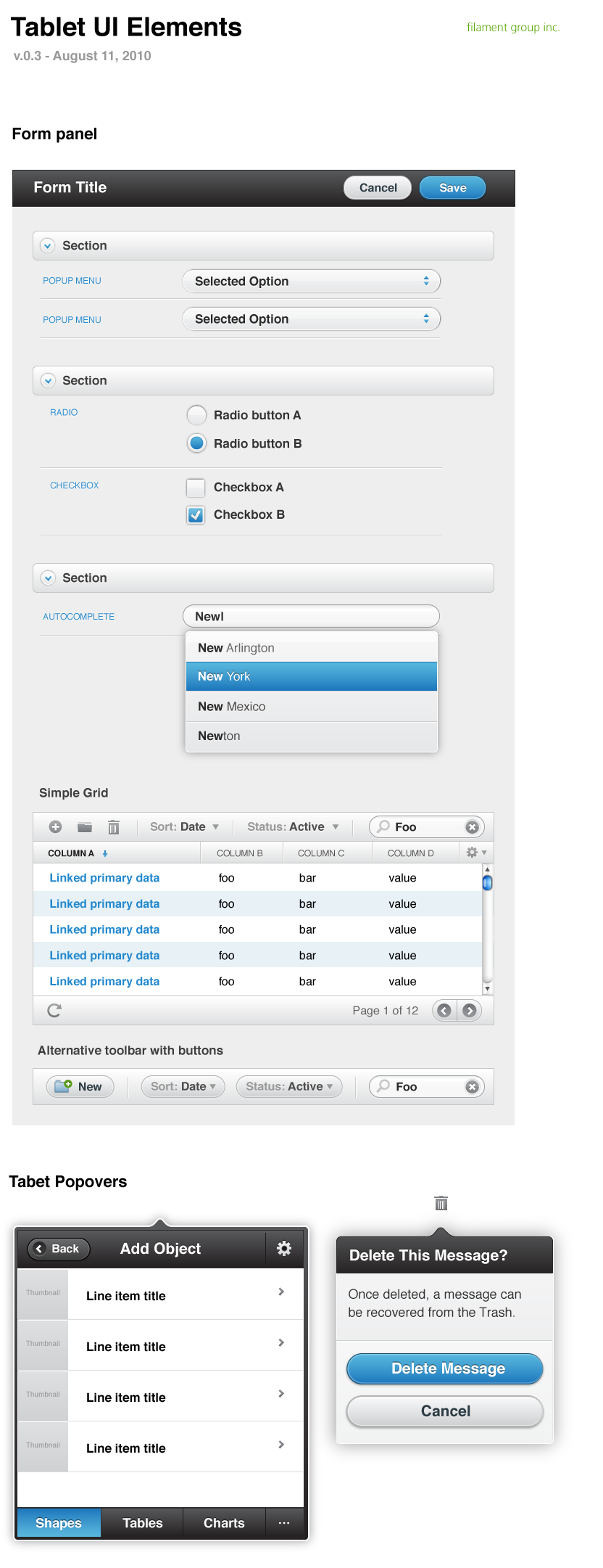
- Tablet UI elements - additional elements that are only appropriate for a larger-format tablet device that we will tackle after the initial release
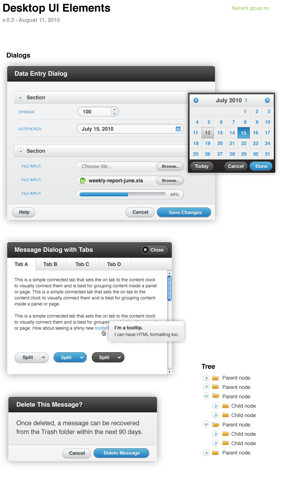
- Desktop exploration - a proof of concept showing how this design system could be slightly tweaked for desktop sites & applications. Not part of the scope of this initial project but important as a larger consideration.
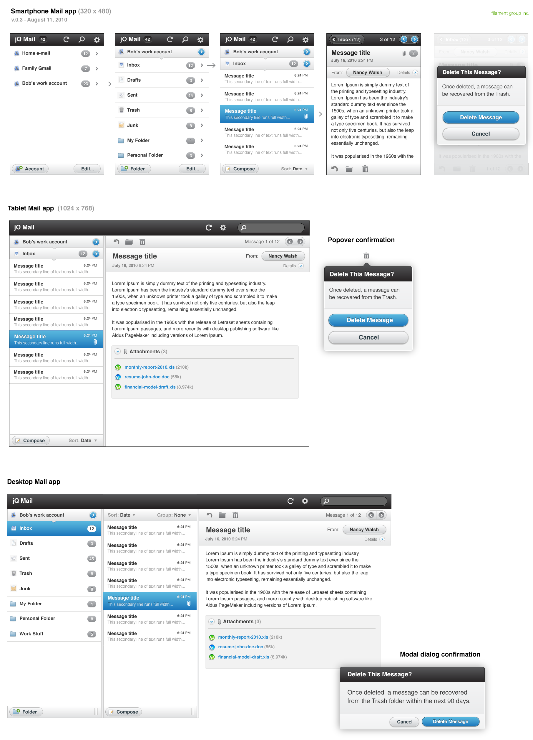
- Mail client exploration - another proof of concept to illustrate a unified approach for the future, showing how we could leverage this UI system to build a mail app appropriate for smartphone, tablet and desktop
(Click designs to view full size)


